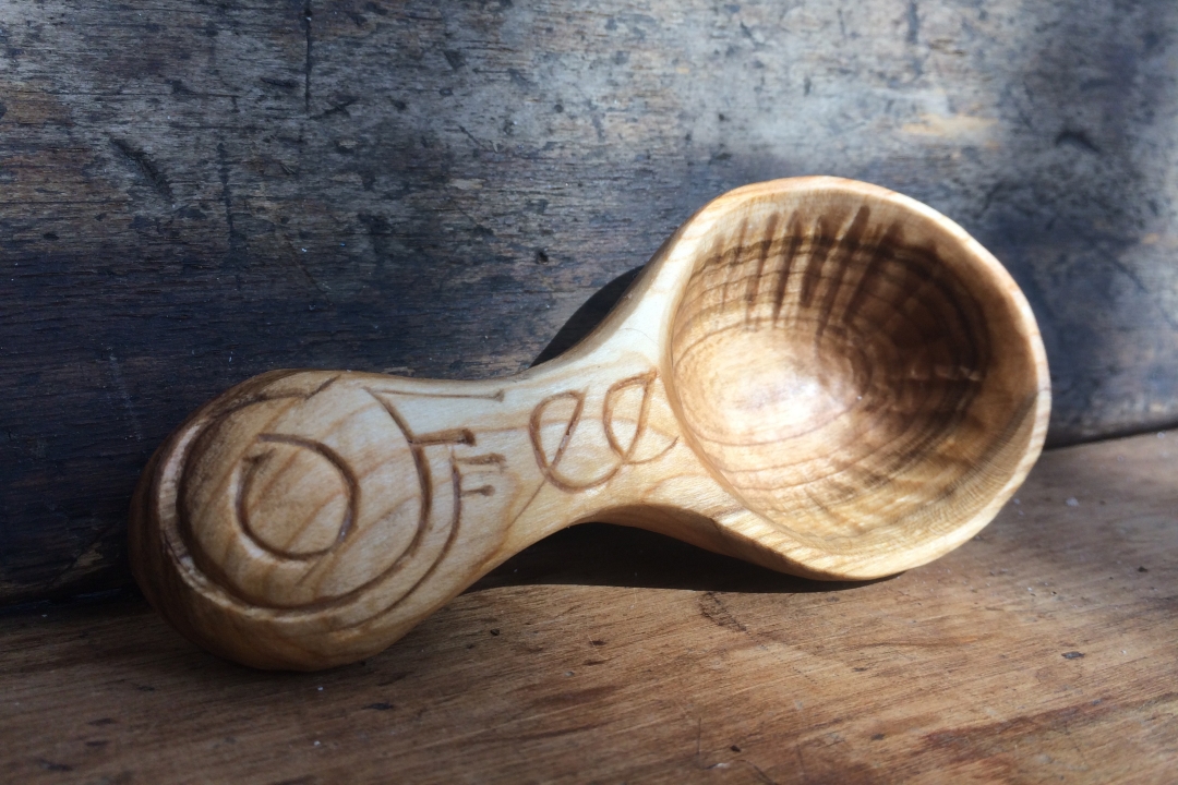
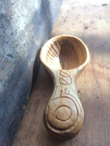
We needed a new coffee scoop in our house so thought I would give it a go with some fancier lettering work. I was very much inspired by the work that David Fisher does. When I think of engraving, I picture block type lettering, but he takes it to a whole new level with elegant flowing letters. His blog, David Fisher, Carving Explorations is extremely helpful all around, but he has a couple great posts on how he does his free-flowing lettering.
This was my go at it. A single perfect word… Coffee. To cut curves in wood that flow nicely is not an easy feat. The grain is constantly trying to pull you away from the line that you have drawn out upon the wood. I used just my jackknife and a lot of concentration trying to keep my hand steady. Utilizing, the hints and suggestions I had gathered prior to starting, I made my way through the letters that spell coffee.
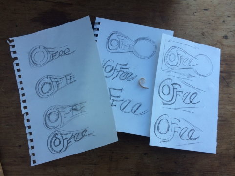
Part of the process also, is designing prior to carving, how you want your letters to flow. I gathered paper and pencil and sketched over and over until I got roughly how I wanted it to look. In the end, a couple of spots aren’t quite what I wanted, were the wood grain was stronger than my hand. But all in all, I am pleased with the outcome and look forward excitedly to gain experience utilizing this type of lettering.
.

That is really awesome! I just got into woodcarving and this is a nice dose of inspiration.
LikeLiked by 1 person
It’s such a great outlet!
LikeLiked by 1 person